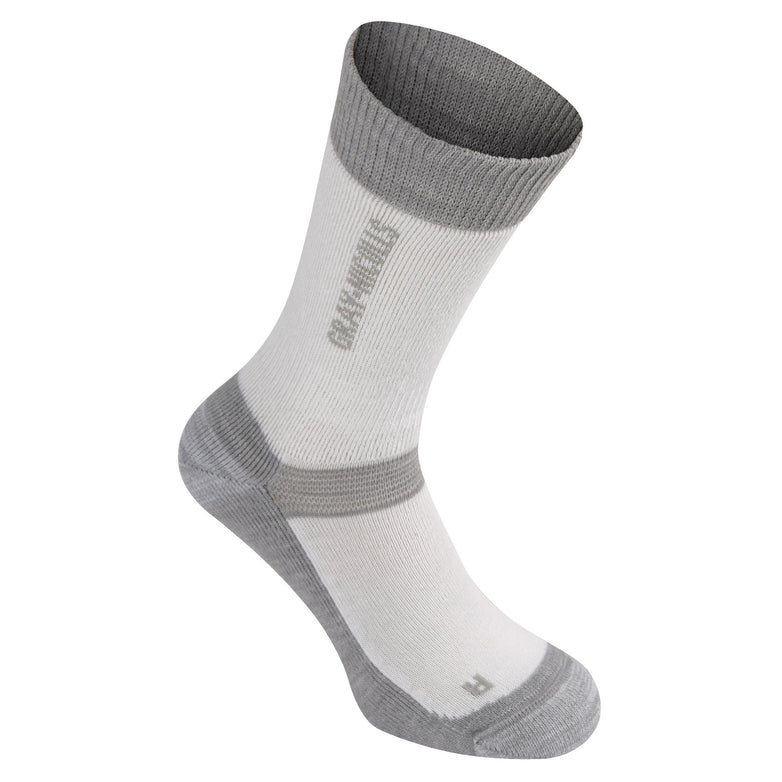
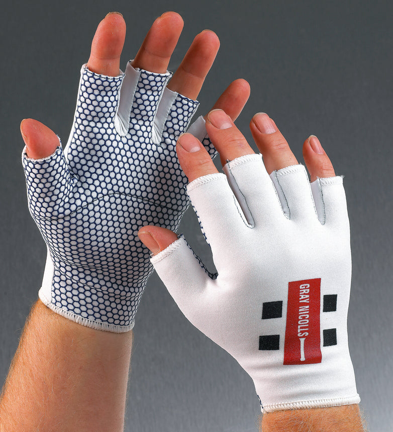
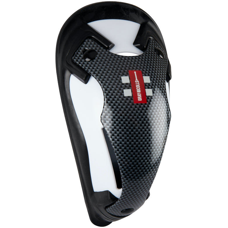
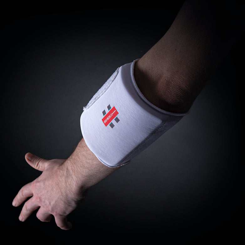
Today, the Gray-Nicolls red flash is an icon of cricket. Yet the story of the brand’s visual identity is one of constant evolution, adapting to the needs of the game while staying true to its heritage.
In the early days, Grays and Nicolls bats were simply stamped with block lettering on the shoulder or spine — the standard of the industry. But as cricket grew and commercialisation followed, branding became more visible. By the 1920s, Nicolls had adopted the Sussex County shield, complete with its mythical martlets, paired with a hand-script typeface.
Following the merger, Gray-Nicolls branding began to appear on the back of bats in the 1940s, while the Nicolls name and martlets remained proudly on the face. By 1968, the Gray-Nicolls bat handle logo had been introduced, a mark still in use today.
Then came a bold innovation. In 1972, Gray-Nicolls became the first brand to use coloured labels. Designed by David Harris and introduced by marketing manager Jack Freeman, the system graded willow quality through a star colour scheme: dark red for 5 Star, green for 4, blue for 3, and grey for 2. The real aim, however, was visibility — ensuring that from 75 yards away, a Gray-Nicolls bat stood out at the crease.
The red label quickly won out, but experimentation continued. Coloured blades followed, with Graham Roope famously using an all-blue bat and Barry Richards sporting an orange one in county cricket. Even the red itself shifted: dark green labels appeared on Scoops in 1976, orange in 1977, before a unified “warm red” was adopted to stand out better on television.
By the 1980s, the red flash was being paired with black bands for maximum visibility, famously worn on David Gower’s and Jeff Dujon’s Dynadrives in the MCC bicentenary match. In 1990, the chequer pattern was introduced, first on bats, then across the wider range. It soon became a registered Gray-Nicolls design, cementing a brand identity that endures to this day.
The red flash, the bands, and the chequers: three elements that together form one of sport’s most instantly recognisable identities.

Did You Know?
When the MCC unveiled its portrait of Sir Alastair Cook at Lord’s in 2024, the artist originally painted the bat face-on. Cook insisted it be turned around to reveal the full Gray-Nicolls branding on the back — a small detail, but one that spoke volumes about his affection for the brand.


